All features should begin with a compelling intro/lead in 'Heading 1 font'
By Tamara Leigh in London (Don't forget to hyperlink the name of the author to the twitter profile
Then you start the feature in 'Normal' font... As you all know, we don't have one concrete set template because the layout depends on the content/text/images, and the story you're trying to tell.
Sometimes the byline is above the intro, as it can interrupt the text, but ideally, it's below the teaser.
For cover images, follow the template above on this page:
Quote/Question above headline
Headline in bold
Date in italics underneath

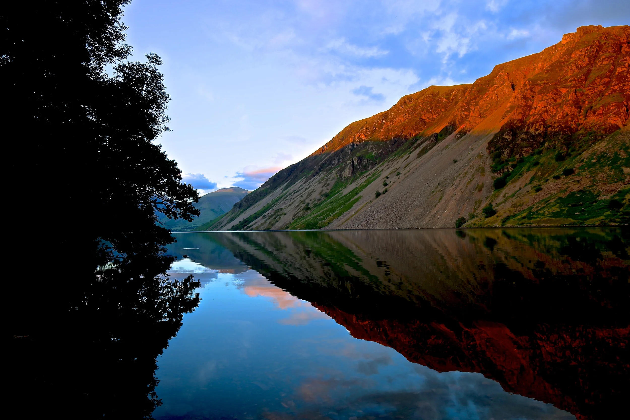
The best cover photos are minimal shots which aren't busy and that you can superimpose text over... For example:

Above, the date is at the end of the feature as it interrupted the cover photo. Or for example...
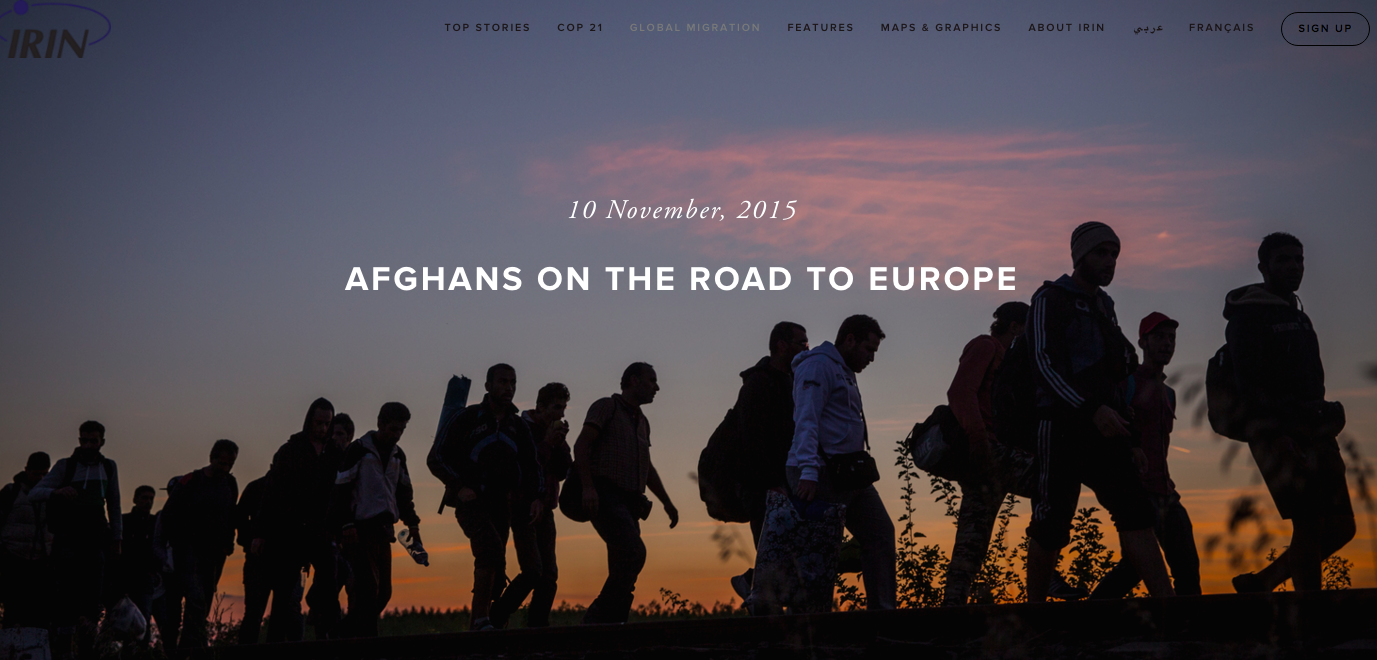
You will notice above that the dateline is above the headline. Although this is not following our usual template, here it works better, because otherwise the date would interrupt the image of people walking.
If there are people in the cover photo/headline image, remember to drop the headline down slightly - and put the dateline under the headline so their faces are not covered.
For example:

Please don't cover the faces like this:

This is better:

You increase space under the headline by pressing Enter in the description box.
Emmeline knows how to do all of this, if you want one on one training.

If the headline is long - break it up over two lines like this:

If you have a good question as a teaser, you can add it above the headline. For example:

If the cover image is strong, there is no need to have a lead intro text above the headline. For example:

“Don’t forget to add pull quotes throughout the feature to break it up. Many online readers scan don’t read, so it’s a good chance to draw their attention to something.”
If you want to add a button on a cover image, example below, you have to hyperlink the text in the description box of the page settings. Again Emmeline knows all of this if you need training.

Slideshow Vs Stacked images really depends on the story you're trying to tell and how you are telling. Sometimes we use a combination. If the photos are very strong and in line with the narrative, they are interspersed throughout the text. If it is an image of a series then we put them in a slideshow.
Don't forget to add some related coverage underneath
and initials of people who have worked on the product, or this is also where you add Edited by Andrew Gully/ Kristy, etc.. Don't forget to hyperlink to your twitter profiles.